Unique Perfect Credenzas
Looking for dining room credenzas to fit a modern home can be rewarding and challenging. In more classic decorative home settings such as traditional, the selection is vast, ranging from antique to new while featuring all types of wood and stains.
Our goal today was to show fourteen examples picked out by our editors that can work from vintage modern to new contemporary construction, providing a cool look and offering ample storage for serving plates, silverware, and other things.
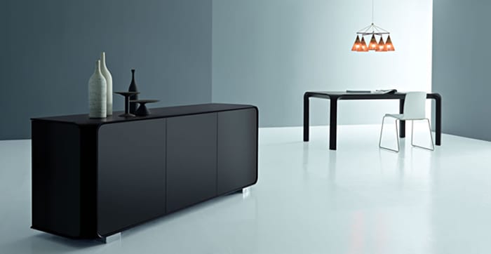
This beauty in black is so smooth that it glimmers in grace, featuring rounded edges to add a purposeful touch. The brushed nickel feet offer some departure from the darker tone.
Still, the piece is so complementary that a person can add many other designs and colors should they want other furnishings to be more exotic in the overall style.
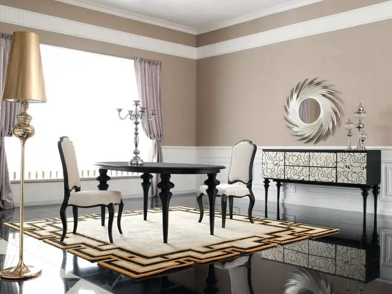
I found this suggestion to be exquisite. It reminds me of an interpretation of a style from long ago that has been made new with changes, making it less bulky and having a classic design on the front.
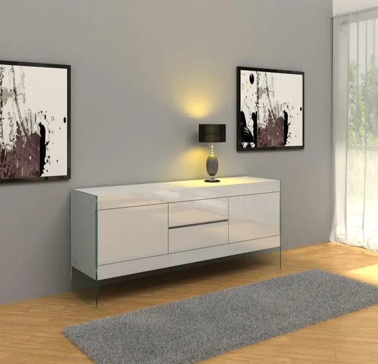
White is always a favorite in contemporary decorating and this contemporary sideboard showcases the power of such a neutral color. It features a wooden laminate with lacquer finishing, completing the overall look. This suggestion is not as long as some others in the list so if you are in a smaller space, this may be needed more.

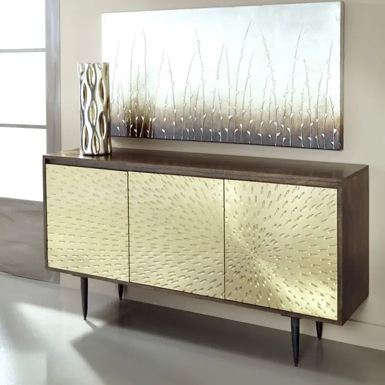
My first impression was that of a porcupine whose quills make up for its line of defense in nature. The way the image emanates from the right panel is very cool. The subtle detailing and touch of gold enhance the overall appeal.
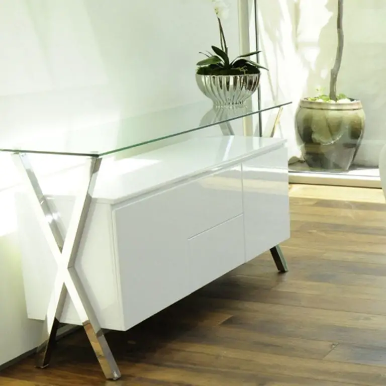
This is an unusual example in white with legs shaped like the letter “X”. What makes it unique, is how the glass table above combines it into one piece. A great feature is how you can dress up the glass and keep the wood surface free of items should the owner choose to.
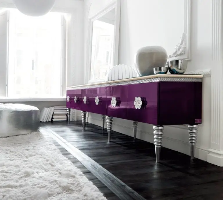
Purple with silver accenting is so brave that I would be remiss in leaving this off the list of dining room credenzas. I thought about this being whimsical and something out of Alice in Wonderland.
Perhaps with the colors yes, but the shape is more conservative than what may be found in that amazing book.
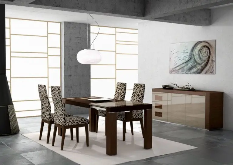
The above image showcases a great neutral idea with wood and light tan or taupe laminate drawers. The L shape was neat, too, in how the designer felt that the left side should not have the support. Then, having the three matching inlays in the left panel was a neat addition to tie the whole look out.
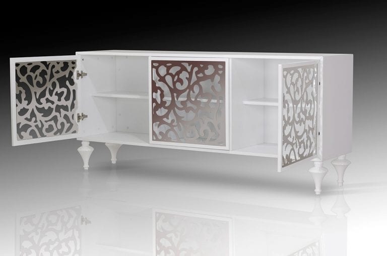
Not many of the dining room credenzas present use the technique of latticework in the doors, but this fine example above does. It's a tasteful design that integrates wonderfully with the white color.
One concern though is that the contents would have to be organized so as not to create a bad visual for guests taking a peek inside.
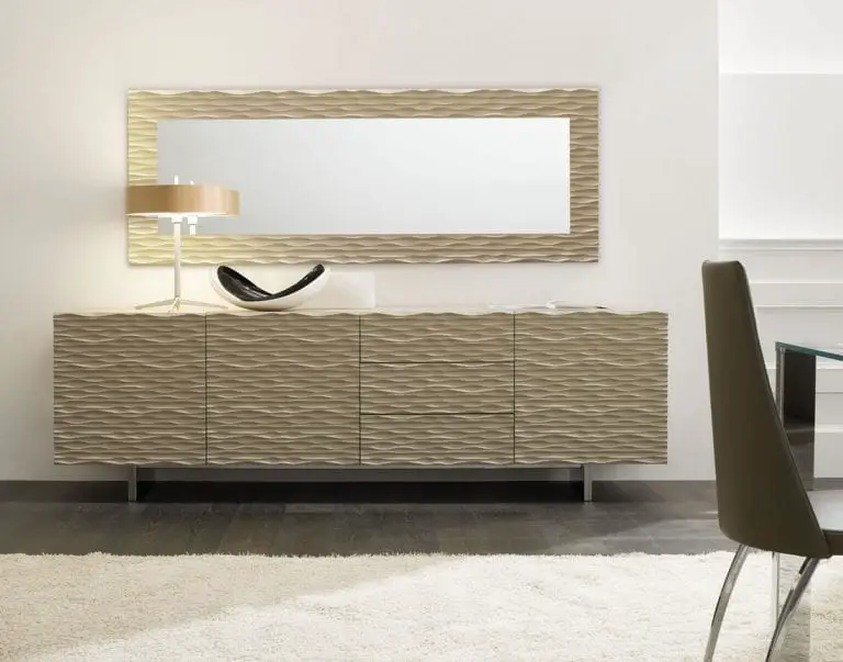
Wavy lines intersect and keep the eye looking either left or right. The larger lines are not the top of the drawers, but just an added touch to break up the style of this idea. Having a matching mirror is a nice compliment in making this a set.
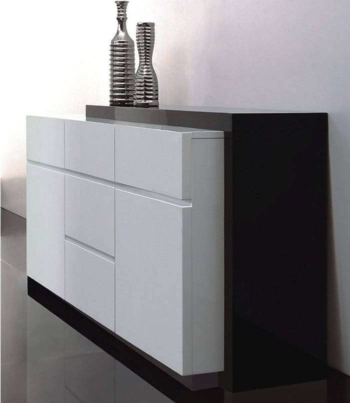
Using white and black together is a hallmark of style in super contemporary homes. I enjoyed this suggestion as it was not boxy and challenged our perception of acceptable shape and mass.
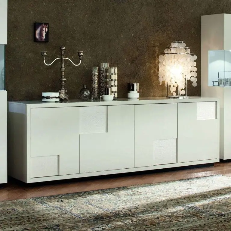
The extra cutouts in the door panels really cause this style to pop. It may otherwise be pretty boring and too mundane for many decorators.
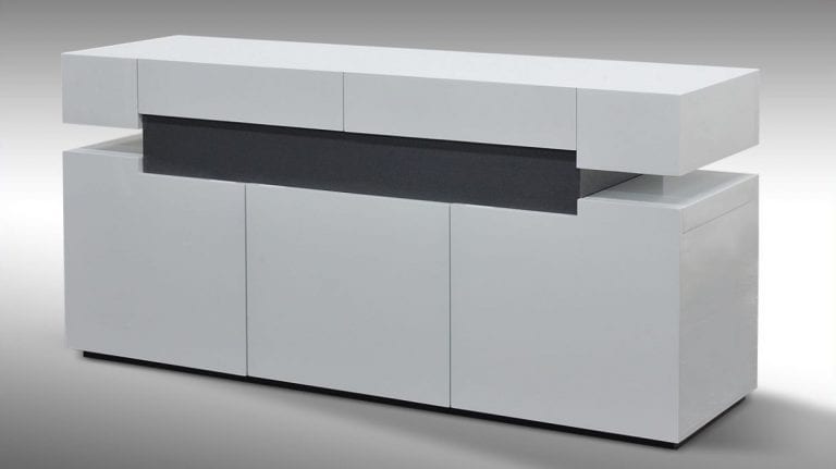
The elevated portion in this example provides a great place of serving dishes and drinks allowing for a buffet style of eating should the owner want to run the party that way.
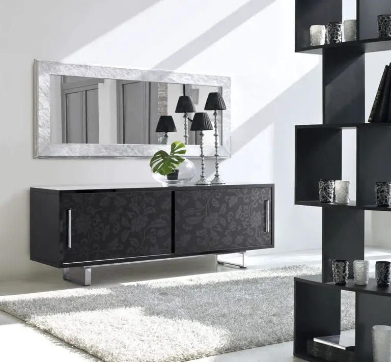
The subtle stamped plant pattern looks great and is so soft that it is not overwhelming. I can see this furnishing working in many homes as it is not overpowering and has a great sense of style.
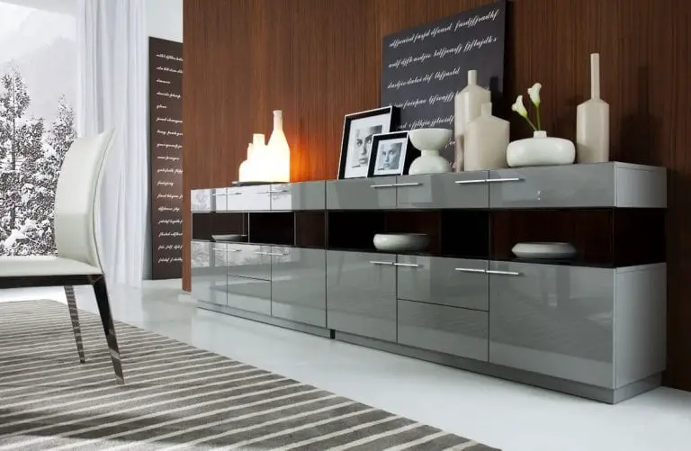
This last idea features a wonderful shade of gray that is neutral and flexible in many homes. Having this up against a wall with the right paint color would be spectacular. I do like the open storage a great deal and think it opens up the appearance of this dining room making it a tiny bit more airy.
