When asked where interior designers get their inspiration, most of us will tell you that it comes from many sources. It is true we have a keen eye for color, texture, pattern, and scale, but we seek sources of inspiration from time to time. When put on the spot, we may not be able to name all of our inspirational material, but much of it comes from real life experiences or images that we see in trade publications. Travel is one of a designer's greatest assets, especially to places most people never see or are unaware of. When I want to produce a look for a special client who wants something different, crisp, refreshing, or eclectic, I often look to Boutique Hotel designs to inspire me. I have collected some of my favorite inspirational photos and will give some brief explanations of the spaces, which will hopefully give you some ideas on how to implement these looks in your own home.
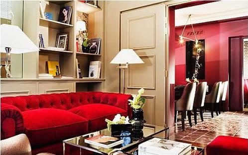
First up is a living space that transitions into a dining area at the Hotel des Academies et des Arts in Paris, France.

This space takes cues from its traditional architectural elements (such as the doors and moldings) and incorporates them into the transitional aesthetic. The cabinetry is glammed up with mirrored nooks and spaces, as well as modernly stylized versions of antique wallpaper patterns, which are then sparsely accessorized with unexpected pieces like brightly colored books and antique photos. Key pieces like the traditional overstuffed sofa and chair are wrapped in luxurious, yet unconventional materials. The velvet on the sofa is not really out of place for a traditional piece, but the red hue and the way this particular velvet catches the light give it an eclectic feel. The presence of the matching ottoman on the right helps to balance out the sofas weight on the left side of the room. The chair, once again cleverly wrapped in what would appear to be traditional leather, is made incredibly unique by the fact that it is an exotic Ostrich Skin. Mirrored nesting tables with chrome frames and modern accessories add transitional charm. The continuous use of chrome and mirror help to unify the room, and bring in additional light.
Next we will look at this playful, yet balanced take on a color filled living space in a junior suite at the Shanghai Hotel in Bangkok, Thailand.

Obviously not an instant hit with everyone, but this colorful space could look amazing as a breakfast area. This photo shows you that colors can, and should be, mixed to create spaces that are exotic, eclectic, and energetic. This image also shows you how to create a more proportionate space by giving the illusion of a lowered ceiling if the furnishings don't quite fit the scale of the space. If you look at the colorful light violet paint on the wall, it is held down from the ceiling line by about 18 inches. This allows your eye to stop at that point, and tricks you into believing that is where the ceiling begins. The plum colored curtains are held at just about the same height as the paint line to create a continuous visual around the room. The poppy red door calls attention to the carved door, a bright exit into a new day. The chairs are the unifiers in this space, bringing in tones of the walls, the door, the dark painted sideboard and the colorful sunflower yellow pot with a pink flowering plant in the background. The rug beneath the table and chairs helps to group them together and provide a grounding place for the grouping to be on the vast stained concrete floor. The colored glass pendant above the table looks like a precious gem in a jewel box.
Even design has its extremes, and it comes as no surprise that “El Bistro” is just as clean and stark as its designer, Philippe Starck himself.

This bistro is located at Faena Hotel+Universe in Buenos Aires, Argentina. The floor, ceilings, and silk fabric walls are all pure white, as are the leather sofas and linens. And yes, those are white unicorn heads sticking out of the walls (the space was inspired by Alice and wonderland in grand Buenos Aires style… something tells me the queen of hearts was in on this one). The punches of red are truly a knockouts, and create a high-profile design one would only find in the most fashion forward of design style. The most obvious red items are the rugs and roses, but look closer, the crystal stemware, candle votives, candelabra accents, and even the eyes of the unicorns are ruby hued. Golden accents can be found on the ceiling, chairs, sofa feet, and candelabra. Mirrors and clear crystal make the rest of the space sparkle.
A couple of these designs may seem a bit extreme, but when designers look for inspiration, we look for “wow factor”. We are fully aware that most consumers are not going to go for an all white room with red accents for their living space, but what about a breakfast area, or powder room? I can see a gorgeous music room with a white baby grand piano and red accents. The colorful Asian space may be an overload of color for some, but could it help you come to terms with the fact that sometimes red and purple really can coordinate? The reason designers get paid to do what we do, is because we can see possibility in a space or picture that most people cannot relate to fitting in their homes. If you love a photo you find in a magazine, but feel you can't achieve it in your space, contact an interior designer and let them help you to turn your inspiration into a feasible reality.
