Storage Wall Modules from Veneta Cucine
Storage wall modules are wonderful in how they can organize a house and provide a great visual other than paint. Veneta Cucine offers five examples that our editors picked out which are electrifying making us want to share these with you today.

Each of these concepts covers many design styles from super contemporary to a more clean and updated traditional look. I find it helpful to think about the current use of walls in your home when you consider products like me.
Many of us simply have paint, wallpaper and some framed pictures. In other words, we don’t have anything too exciting. Transforming that ideal can really liven up a living space and make a home more beautiful.
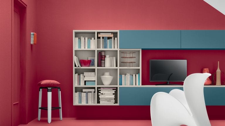
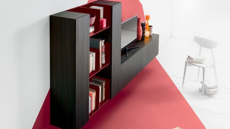
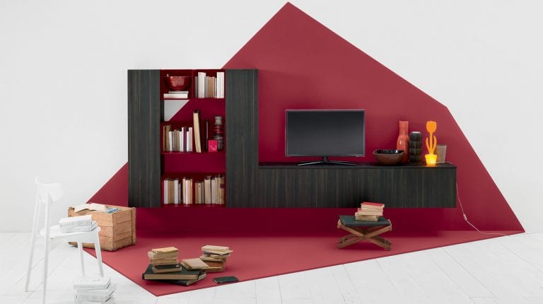
Isn't the crimson just stunning in the above picture. Even for people that are not too bold in their color selection this hue has great appeal. The darker stained cabinets and shelves are wonderful too. This would go great in a large open room such as one that may be found in a high rise or loft. Books are always a problem and it's nice there is a place to tastefully present them.
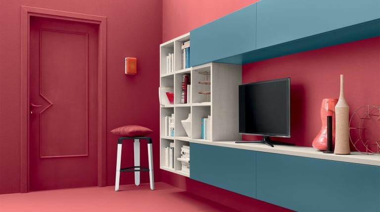
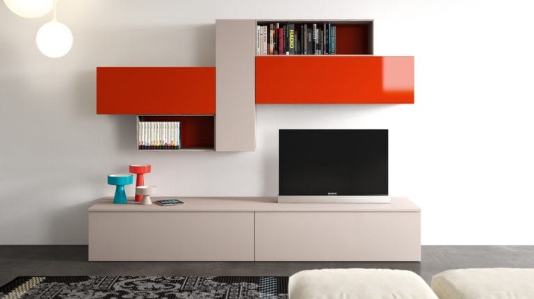
The clear lacquer coat really causes these to pop above. Orange creates a bold statement and here it is softened by being offset with Dove gray. Notice too the spacing where the television goes.
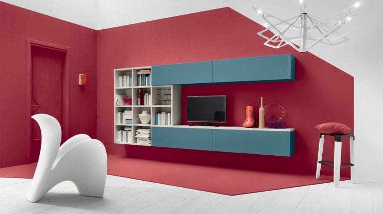
This could easily be increased to allow for a larger TV to be placed there. I do like the geometry created in the pattern of how the angles intersect in a design that is full of purpose and precision.
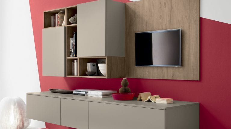
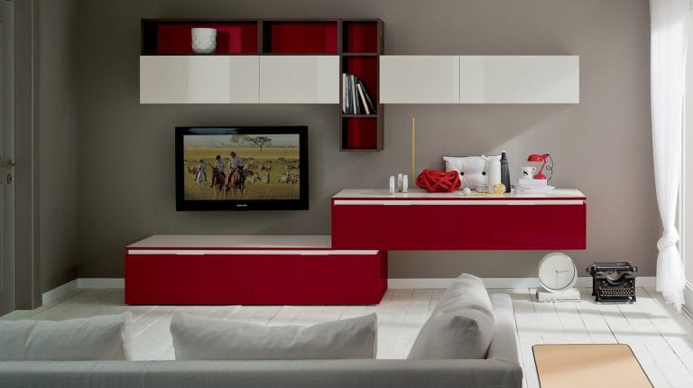
Of the five storage wall modules this one perhaps offers the most robust color combination featuring red and white. The handles on the cabinets create a nice white trim that also mesh with the tops.
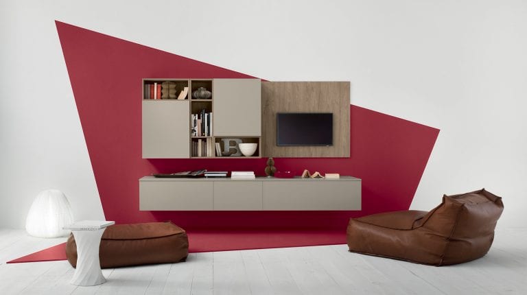
What a great idea the home owner had adding that same shade of red as the back drop in the open shelves. The bottom pair arrangement is superb in how one is placed on top of the other. To the very right you can see what appears to be a clock underneath, and I wonder if it serving as a stabilizer as well.
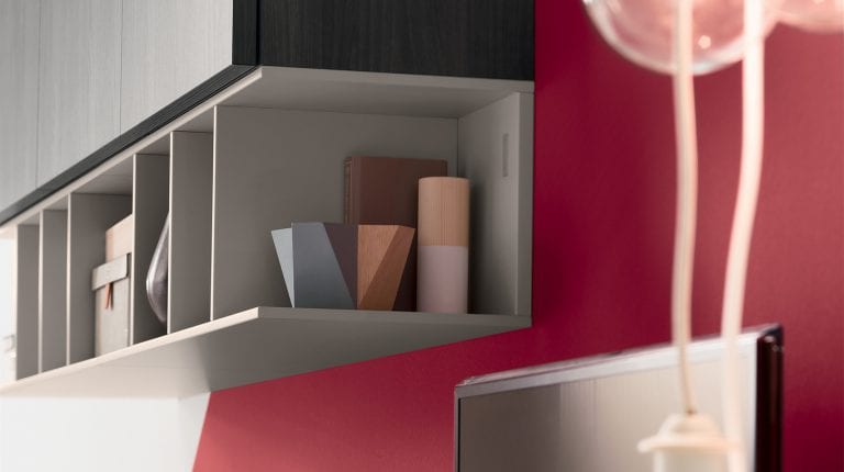
This example from Veneta Cucine really shows if you cover the majority of wall space how that may look in a room. They did a fine job in doing so, and also in not making the room look crammed and cluttered. Some examples of home libraries with floor to ceiling bookcases can really take over a room and detract from the overall appearance.
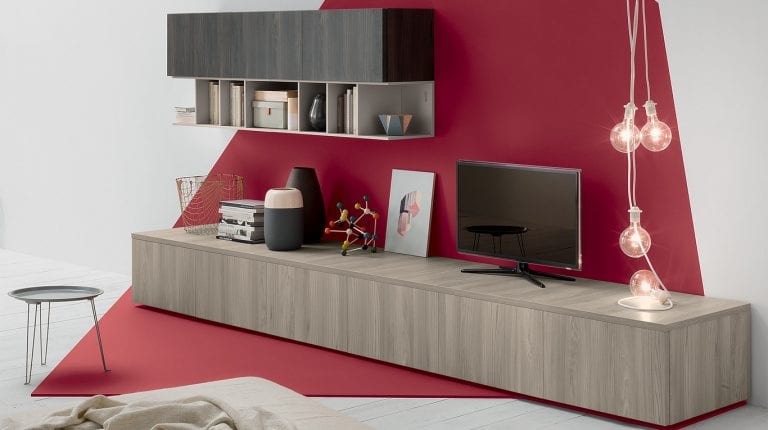
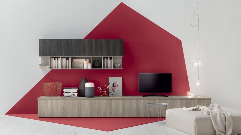
This tasteful model features the same crimson with a slightly different color combination. The shape is very interesting of the background as it is not rectangular or square. This small format piece would do well in a small space and being very fun to enjoy.
